U.S. Data with Statebins
Statebins is one of the few visualization libraries I’m excited about these days. It took me a while to get around to trying it but I can say confidently that I’ll be using this one a lot in the future.
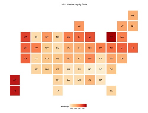
A few months ago I saw a post about State Bins, an R package emulating these Washington Post charts. I wanted to put a quick blog post together utilizing but the framework to make a chart. I grabbed this union data from CNN.com and was on my way.

The code is straight forward. You can edit colors using color brewer and edit where the titles go as well. I think there is a lot of potential for the package and like I said before I’ll be presenting US State data this way more often.