Visualizing discontinuous web data
Regression discontinuity design (RDD) is a growing technique in empirical academic research. The mathematics and theory behind RDD elegant, but the explanation is relatively straightforward. The idea is that under the right conditions, some events or thresholds can be viewed as an experimental assignment. Essentially, the people who are on the margin (right before and right after the change) are a pre-test, post-test group, as long as all other things remain constant. It is required that the threshold or change be exogenous to the groups, that is, outside of their control. If all these things hold, then you are onto something. You can see how this indiscriminate assignment influences some outcome(s) in this group.
One of the coolest examples I’ve seen that utilizes this technique is a paper from the American Economic Journal: Applied Economics. The paper is titled The Effect of Alcohol Consumption on Mortality: Regression Discontinuity Evidence from the Minimum Drinking Age. Besides being an incredibly academic title, the paper uses the legal drinking age (21 in the U.S.) to show how alcohol consumption effects mortality. The age 21 is a discontinuous point at which drinking goes from a thing get you arrested for to a thing you can do at anytime or any day. The authors estimated that mortality rate was increased by 9 percent due to motor vehicle accidents, and other alcohol related deaths.
Estimation of these models is a very complicated task that I won’t cover in this post. For this post I want to focus on how I used ideas from this technique to visualize changes in web data that I analyze.
The Use Case
In the world of web and application development, there is a constant cycle of development and quality assurance testing. Unfortunately, getting a good process down that avoids slip ups takes a long time to get in place and is often impossible for products at a very large scale. Bugs will happen, and user experiences will be influenced as a result of those bugs. Even worse, we might be running an application without knowing the bug exists for a long time. The common question I am asked is; what is the impact of these changes on site/application behavior?
My task is often to determine how a bug, introduced at a software update influences site related conversion. In this example I used data available from Google Analytics to investigate the issue.
Visualization
I used R and ggplot 2 to create this visualization. I wanted to look at how the data trended before and after the release. I created two groups “pre update” and “post update”, based on the date of the release. I then draw a vertical line right where the change happened. After that I created a scatter plot of each and fit a simple linear model.
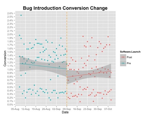
Not much appeared to have happened after the release. Let’s take a look at how this varies by device type. In my dataset I have three groups: mobile devices, tablets and desktop.
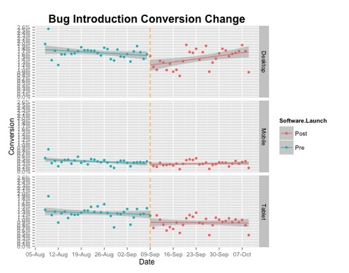
The desktop group appears to have the greatest change, but it is something I will need fit a model to check if differences are statistically significant. In a future post I will discuss how to use the rdd package in R to estimate models with discontinuous data.
Code: