Trying GGVIS
As an R User I’ve used ggplot2 for years and so I was naturally reluctant to give ggvis the attention it deserves. GGVIS is the new kid on the block and while I’ve seen a few articles written about why it’s cool, I still haven’t seen many blog posts utilizing it.
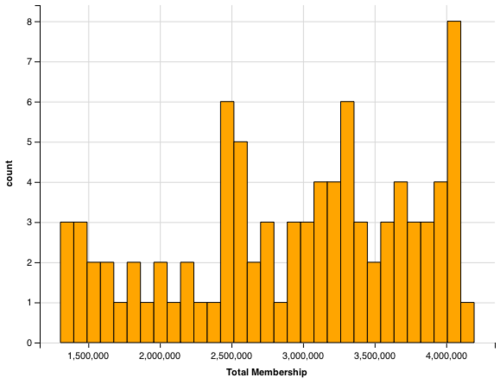
I decided to redo a graph I created for a blog post about Freemason membership in order to highlight some features of GGVIS and some struggles I’ve experienced with it.
Syntax
The syntax is similar to ggplot2, I used the pipe operator (%>%) instead of the (+) operator because I just wanted to try something new. The one syntactic thing I found was the use of the (:=) operator. I can’t remember seeing that operator in the context of creating graphics, but it took only a short time to get used to.
Beaut
I think the output of ggvis is elegant in its current form and will become increasingly elegant with time. I love the ability to embed an SVG of a plot and I also love the ability to add interactivity to the plots. There’s room to grow but where it’s at now is impressive.
Struggles
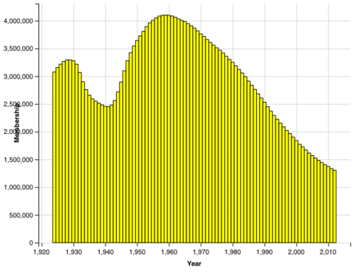
I had two unexpected hiccups when using ggvis. The first was the offset of the text on the Y axis. With the larger numbers the text of the y-axis were automatically covered up by the values on the axis. I had to use the offset option (see below) in order to fix that issue.
Without off set:
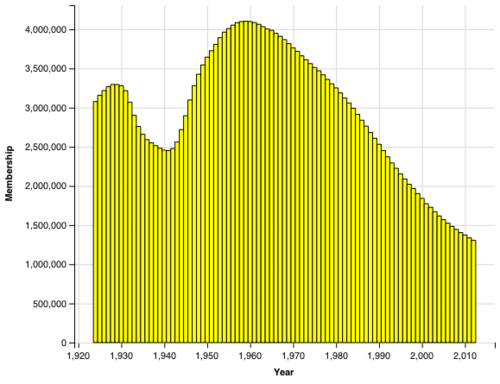
With off set:
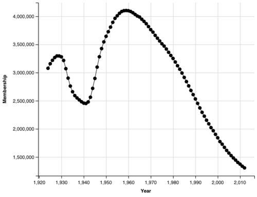
The second hiccup I had was with using years on the x axis. When I tried to use a date format I got some pretty wonky results. I followed along the documentation but that threw an unknown type error. When I kept it as an integer it worked as expected but the x axis has commas in it instead of looking like a year.
Final Thoughts
Overall I like ggvis, I think it’s a great addition to the graphics capabilities in R and It is visualization for the next generation. I’m planning on using it in upcoming projects.
Plots:

Code: